七种CSS方式让一个容器水平垂直居中
- 时间:2016-09-26 17:45
- 来源:下载吧
- 编辑:xusuwen
阅读目录
方法一: position 加 margin
方法二: diaplay:table-cell
方法三: position 加 transform
方法四: flex;align-items: center;justify-content: center
方法五: display:flex;margin:auto
方法六:纯 position
方法七:兼容低版本浏览器,不固定宽高
总结
这种 css 布局平时用的比较多,也是面试题常出的一个题,网上一搜一大丢,不过还是想自己总结一下。
这种方法比较多,本文只总结其中的几种,以便加深印象。
方法一: position 加 margin
/html/
/css/ .wrap { width: 200px; height: 200px; background: yellow; position: relative; } .wrap .center { width: 100px; height: 100px; background: green; margin: auto; position: absolute; left: 0; right: 0; top: 0; bottom: 0; } 兼容性:主流浏览器均支持, IE6 不支持
方法二: diaplay:table-cell
/css/ .wrap{ width: 200px; height: 200px; background: yellow; display: table-cell; vertical-align: middle; text-align: center; } .center{ display: inline-block; vertical-align: middle; width: 100px; height: 100px; background: green; } 兼容性:由于 display:table-cell 的原因, IE6\7 不兼容
方法三: position 加 transform
/* css */ .wrap { position: relative; background: yellow; width: 200px; height: 200px;}
.center { position: absolute; background: green; top:50%; left:50%; -webkit-transform:translate(-50%,-50%); transform:translate(-50%,-50%); width: 100px; height: 100px; } 兼容性: ie9 以下不支持 transform ,手机端表现的比较好。
方法四: flex;align-items: center;justify-content: center
/* css */ .wrap { background: yellow; width: 200px; height: 200px; display: flex; align-items: center; justify-content: center; }
.center { background: green; width: 100px; height: 100px; } 移动端首选
方法五: display:flex;margin:auto
/* css */ .wrap { background: yellow; width: 200px; height: 200px; display: flex; }
.center { background: green; width: 100px; height: 100px; margin: auto; } 移动端首选
方法六:纯 position
/* css */ .wrap { background: yellow; width: 200px; height: 200px; position: relative; } /方法一/ .center { background: green; position: absolute; width: 100px; height: 100px; left: 50px; top: 50px;
} /方法二/ .center { background: green; position: absolute; width: 100px; height: 100px; left: 50%; top: 50%; margin-left:-50px; margin-top:-50px; } 兼容性:适用于所有浏览器
方法六中的方法一计算公式如下:
子元素( conter )的 left 值计算公式: left=(父元素的宽 - 子元素的宽 ) / 2=(200-100) / 2=50px; 子元素( conter )的 top 值计算公式: top=(父元素的高 - 子元素的高 ) / 2=(200-100) / 2=50px;
方法二计算公式: left 值固定为 50%; 子元素的 margin-left= -(子元素的宽 /2 )=-100/2= -50px; top 值也一样,固定为 50%
子元素的 margin-top= -(子元素的高 /2 )=-100/2= -50px;
方法七:兼容低版本浏览器,不固定宽高
不固定宽高,自适应
/css/ .table { height: 200px;/高度值不能少/ width: 200px;/宽度值不能少/ display: table; position: relative; float:left; background: yellow; }
.tableCell { display: table-cell; vertical-align: middle; text-align: center;
*position: absolute; padding: 10px; *top: 50%; *left: 50%; } .content { *position:relative; *top: -50%; *left: -50%; background: green; } 暂时总结上面的七种,这种方法太多,其实只要习惯了其中的一两种也就够用了。
总结
如果是移动端,那么用方法四和方法五是比较方便的。而且支持不固定宽高的情况,快、准、狠
也就是用 flex; align-items: center; justify-content: center;
/* css */ .wrap { background: yellow; width: 200px; height: 200px; display: flex; align-items: center; justify-content: center; }
.center { background: green; width: 100px; height: 100px; } 或者 display:flex;margin:auto;
/* css */ .wrap { background: yellow; width: 200px; height: 200px; display: flex; }
.center { background: green; width: 100px; height: 100px; margin: auto; } 如果是 PC 端,要考虑兼容性的话。方法六是不错滴,也就是纯 position 。
/* css */ .wrap { background: yellow; width: 200px; height: 200px; position: relative; } /方法一/ .center { background: green; position: absolute; width: 100px; height: 100px; left: 50px; top: 50px;
} /方法二/ .center { background: green; position: absolute; width: 100px; height: 100px; left: 50%; top: 50%; margin-left:-50px; margin-top:-50px; } 如果 PC 端的中间的元素高度不固定,那么就用方法七即可,代码就不复制了
这种 css 元素垂直的如果真的要总结起来,应该有十几二十几种。不过也没必要全部掌握吧,只要大概了解一些,用起来没有副作用就行。
最近更新
-
 淘宝怎么用微信支付
淘宝微信支付怎么开通?9月5日淘宝公示与微信
- 2 手机上怎么查法定退休时间 09-13
- 3 怎么查自己的法定退休年龄 09-13
- 4 小红书宠物小伙伴怎么挖宝 09-04
- 5 小红书AI宠物怎么养 09-04
- 6 网易云音乐补偿7天会员怎么领 08-21
人气排行
-
 Visual Studio 2017正式版下载地址 Visual Studio 2017官网
VisualStudio2017正式版下载地址分享。VisualStudio2017正式版已
-
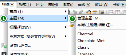 UltraEdit(UE)背景颜色怎么改才能看的舒服
UltraEdit简称UE编辑器,是很多码农朋友常用的一款编辑器,工作上
-
 sublime text3 字体大小设置教程
SublimeText3是一款非常好用的文本编辑器软件,用上sublimetext3
-
 2016cad快捷键命令大全,AutoCAD快捷键命令大全
学习cad掌握cad快捷键命令是基础,下面为大家介绍2016cad快捷键命
-
 AutoCAD2015中文版超详细安装激活图文教程
刚刚发布的AutoCAD2015是Autodesk公司出品的CAD软件,借助AutoCA
-
 CAXA与AutoCAD数据之间的转换技巧
现在随着CAXA电子图板的广泛普及,越来越多的企业选择CAXA电子图
-
 SQL Server 2008通过端口1433连接到主机127.0.0.1的TCP/IP连接失败
相信SQLServer2008的朋友,有时候会遇到:用过通过端口1433连接到
-
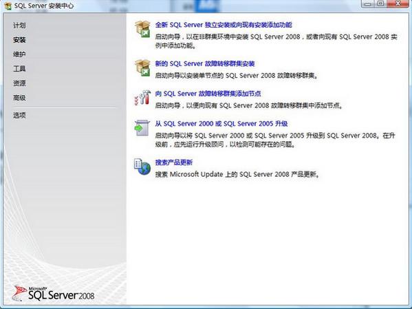 图解SQL Server 2008如何安装
SQL在企业中也是非常重要的应用,各种财务系统,ERP系统,OA系统
-
 Visual Studio 2010安装教程
VS2010是一个集C++,VB,C#,等编程环境于一身的集成开发环境,功能
-
 Mysql安装图文教程
Mysql是一款功能强大的数据库软件,Mysql安装图文教程将介绍如何安